Gallina Blanca — Custom typeface & wordmark
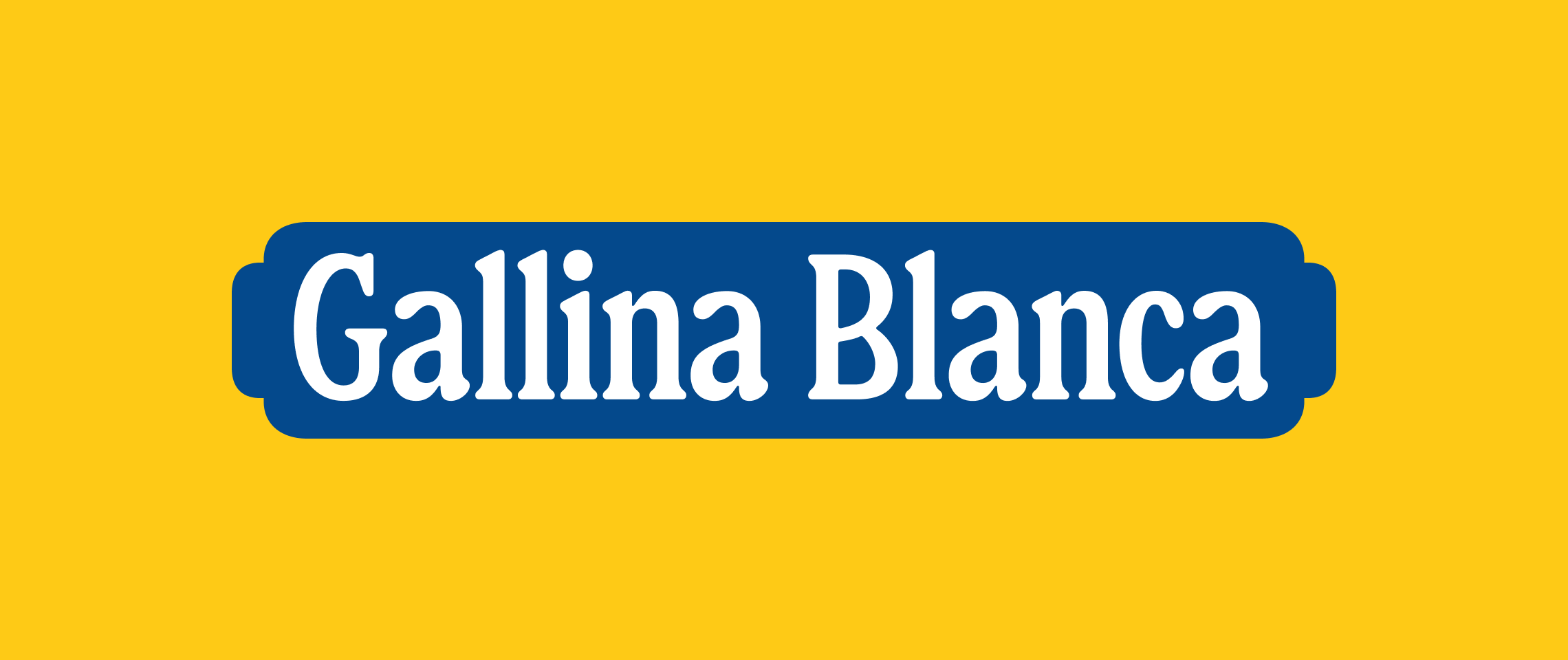
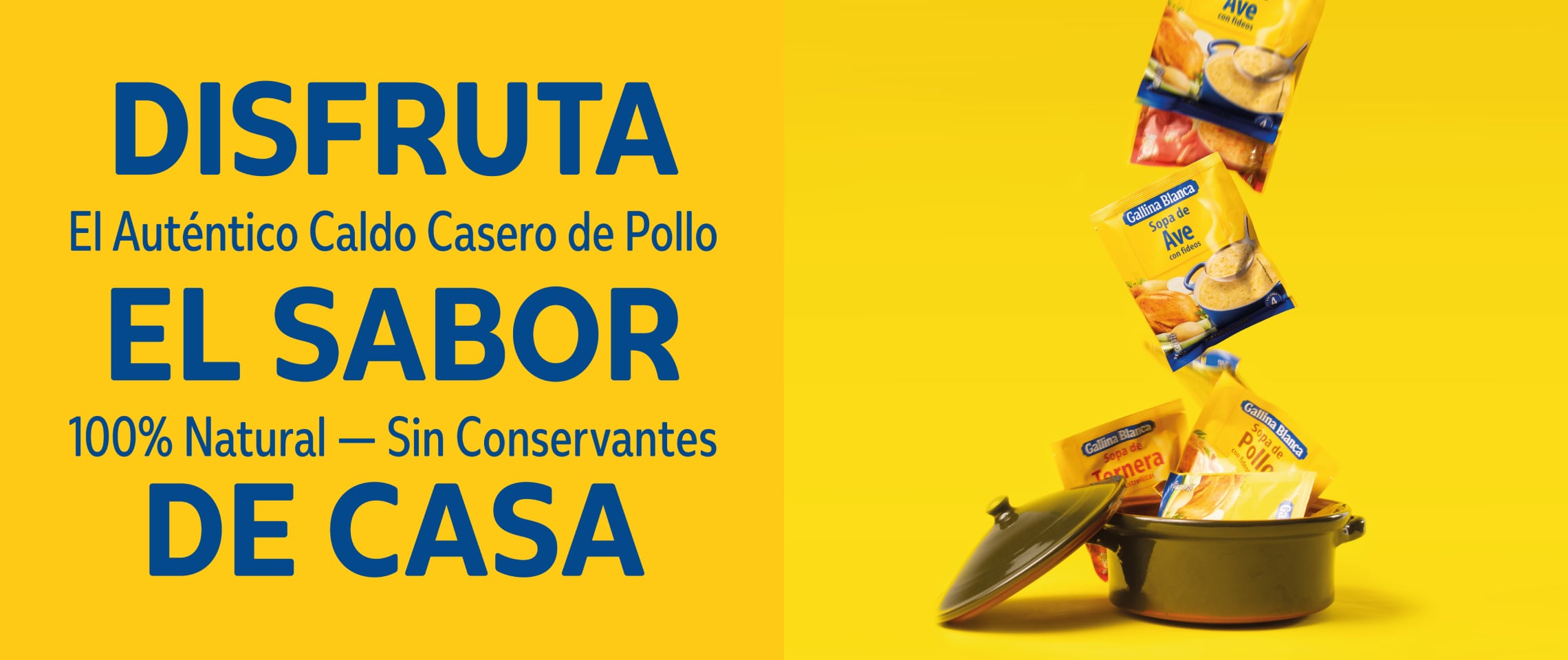
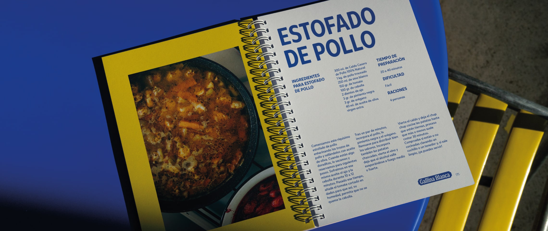
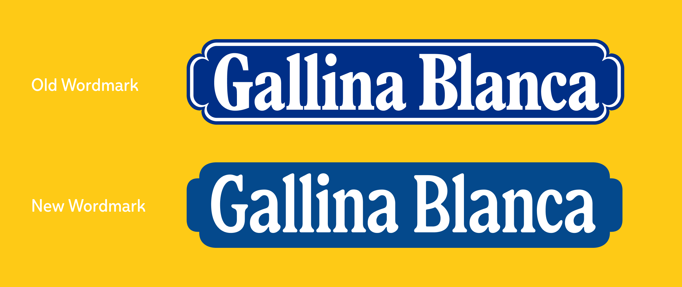
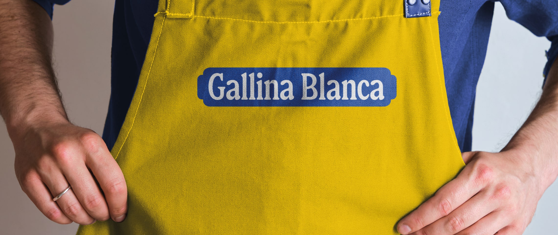
New wordmark and type system for Gallina Blanca — a historic Spanish FMCG brand that has fed families and friends across the country since 1936 — as part of the rebranding developed by Morillas Branding.
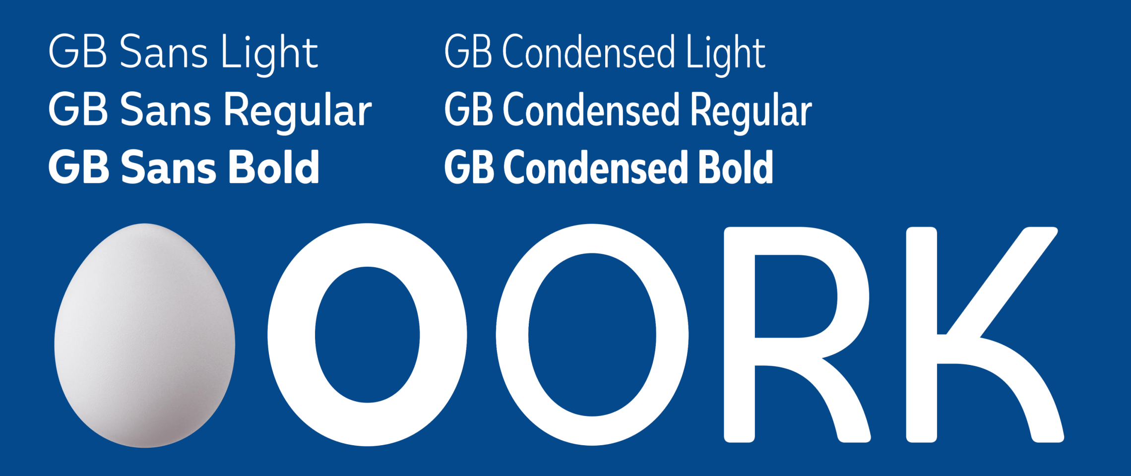
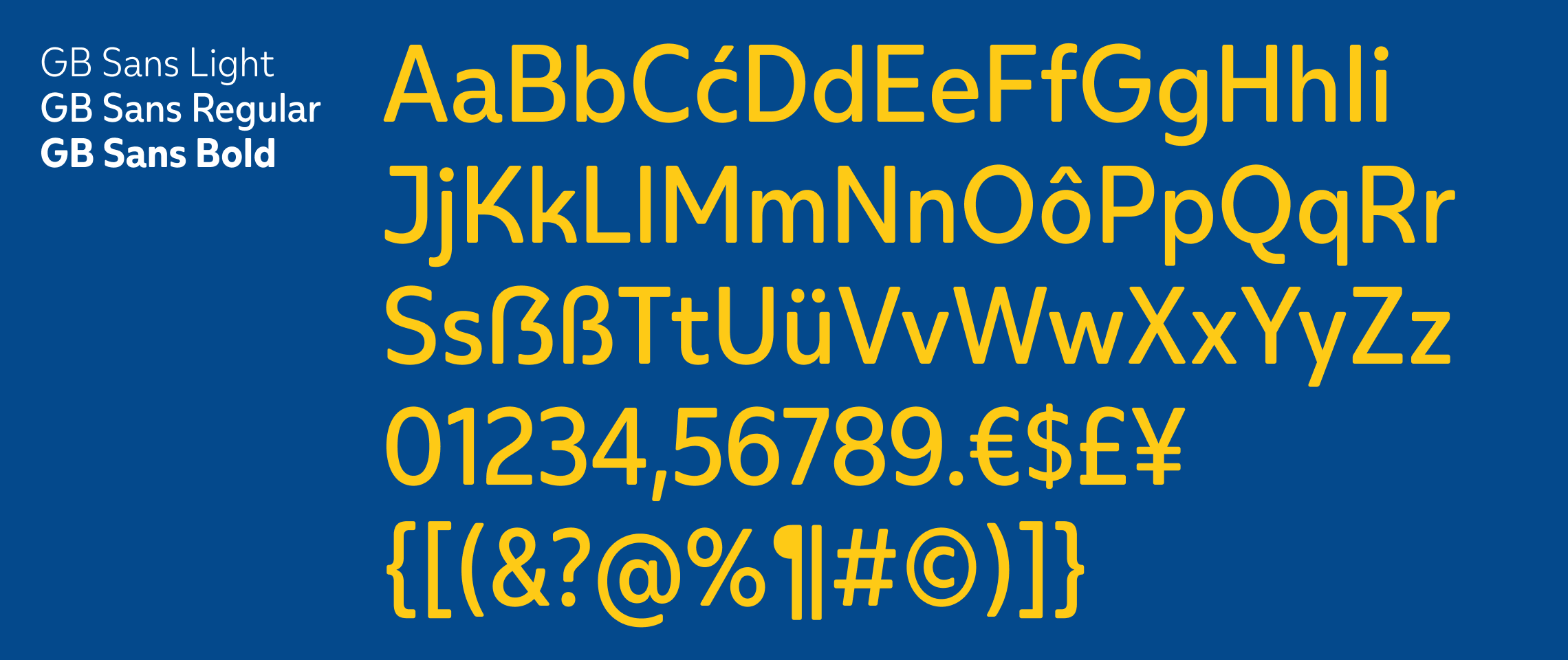
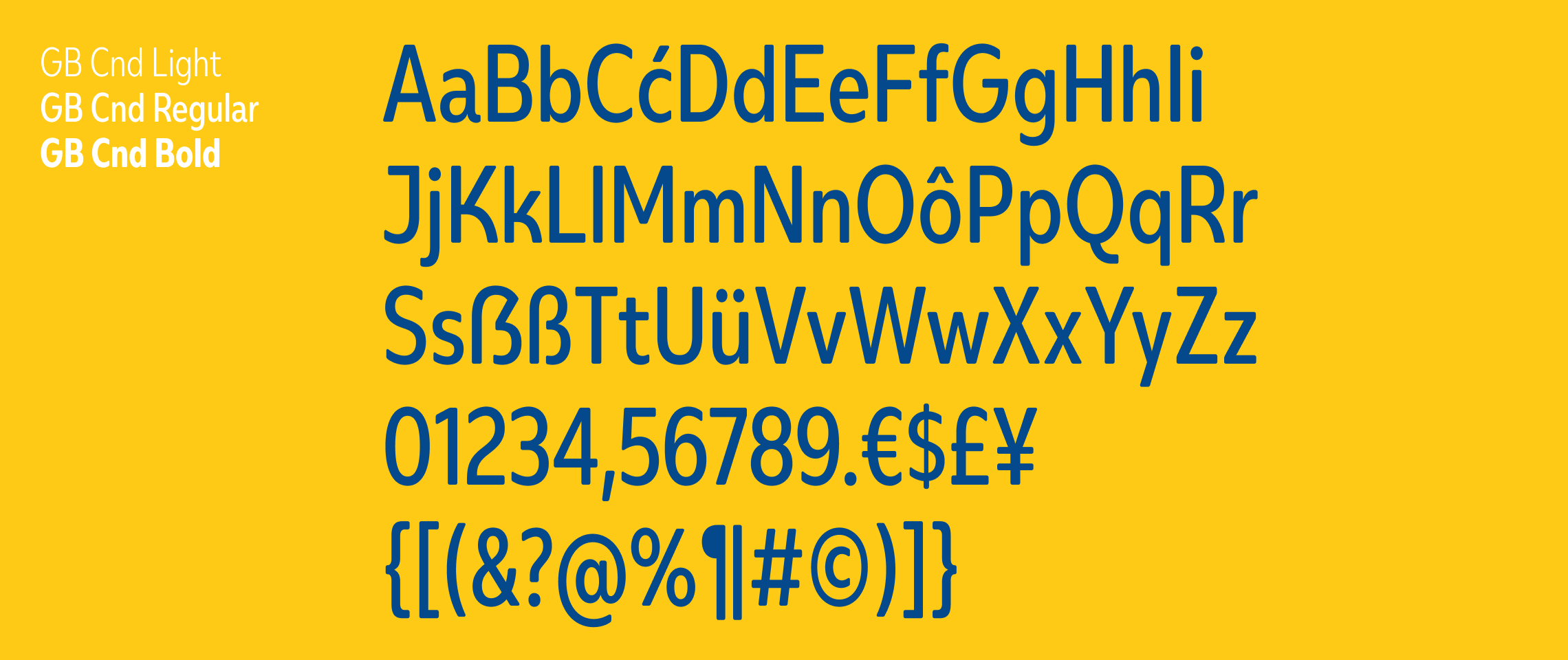
The new wordmark is a reimagined version of the old one based on the concept “Como en casa’” (“Like at home” in Spanish), which is inspired by its classic visual assets and typographic elements, thus making something that felt fresh, but true to its origins. We also designed a font family containing 6 fonts along 3 weights and 2 widths. The design was inspired by an egg, which reminisces of home, a place to feel cared for and well-fed. It’s friendly, and unequivocally associated with the brand’s “gallina” (“hen” in Spanish).
All our bespoke projects come with our All-Inclusive®️ licence, allowing brands to use their fonts with no limits nor complications. A custom typeface is the best way to convey a unique voice for brands, see more custom type projects.
For more details please contact us →