


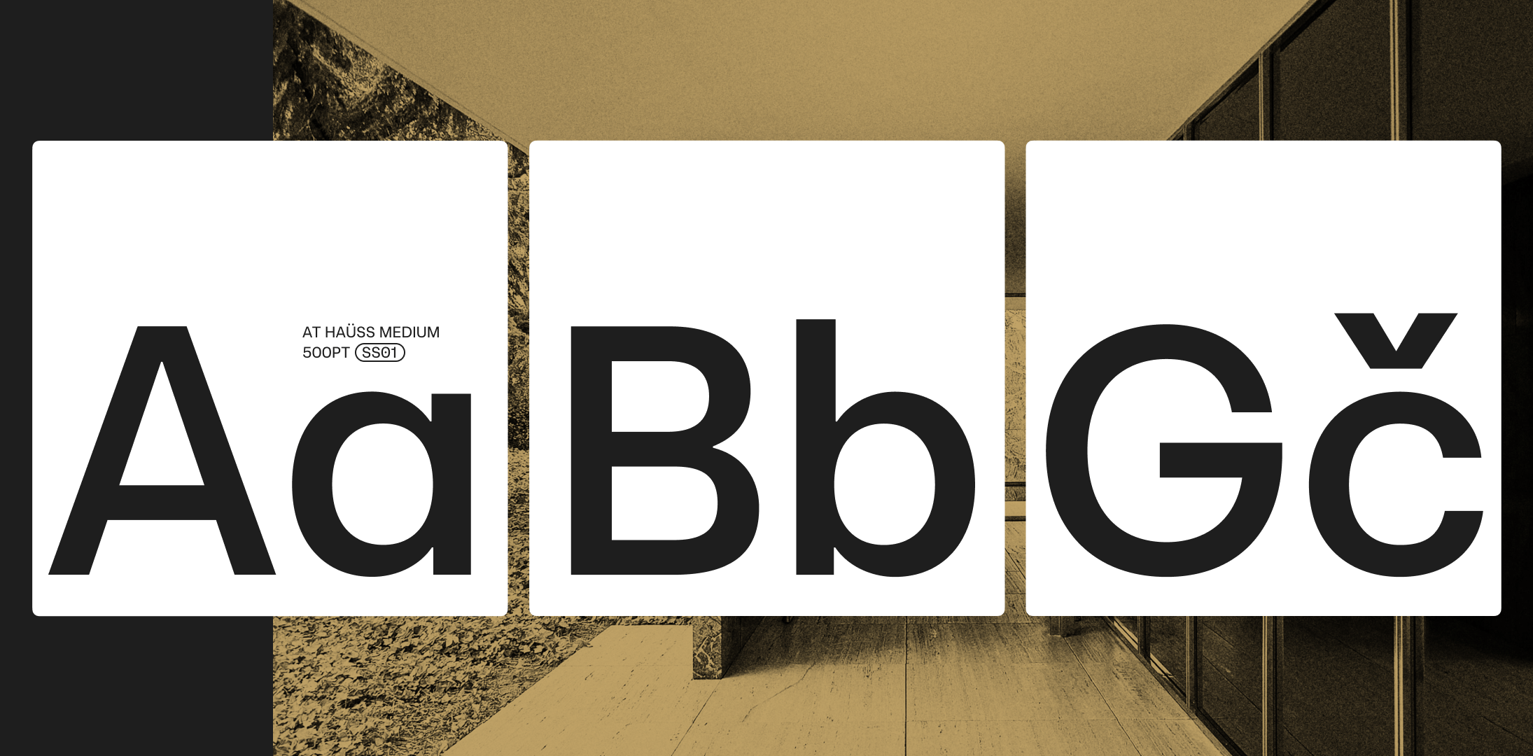

At Haüss is a contemporary celebration of mid-20th-century neo-grotesque typefaces. The project was not driven by nostalgia, but by the wish to re-think the design features we all love and adapt them to modern tastes and current user needs. The result is a pure and elegant typeface standing on a solid and balanced structure. Born for maximum performance in communication.
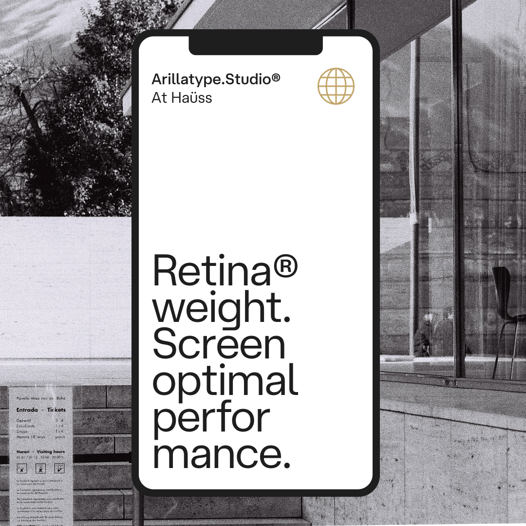
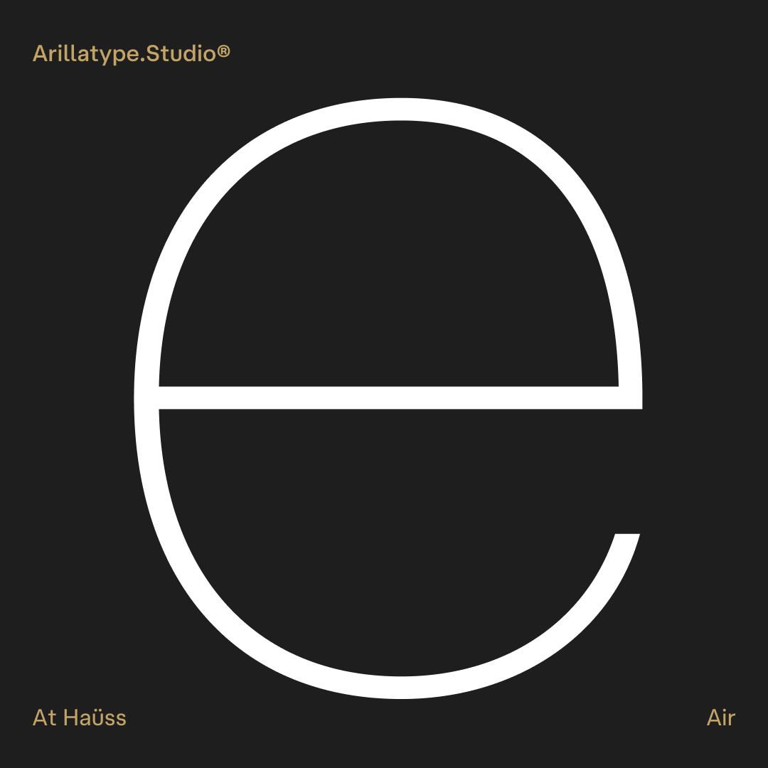
At Haüss comes in 20 styles — starting with the delicate Air, crossing paths with the optimised for high-density screens Retina, and arriving at the robust Super. At Haüss is also available as a variable font with two axes: Weight [Air–Super] and Italic [0°–10°]. By purchasing the full family you get the variable font.
At Haüss is part of the At Haüss Collection together with At Haüss Arabic and At Haüss Mono. They are available for customisation, language extensions and special licensing needs. Contact us →
And also: Solid numerals, Circled numerals, Roman numerals, Case-sensitive forms, Tabular figures, Superiors, Inferiors, Fractions, Slashed zero, Ordinal indicators, Standard ligatures, Contextual alternates.
Designer
Pedro Arilla
Visuals
Alonso & Moutas
Release date
May 2022
Current version
1.200
(December 2022)
Styles in the family
20
(10 weights with italics)
Glyphs per style
608
Character set
Latin Extended
(100+ languages support)
Formats
.otf (desktop)
.woff, .woff2 (web)
.ttf, .woff, .woff2 (variable)
Sizes
~108kb per font (.otf)
~44kb per font (.woff)
~41kb per font (.woff2)
259kb (.ttf — var)
103kb (.woff — var)
89kb (.woff2 — var)