Android — Wordmark & Sub-brands
A new modern look for the world’s largest operating system. Android has 3.5 billion active users, 12 million developers, and powers the Google ecosystem. But the old brand itself was static, disconnected, corporate, increasingly invisible, and losing market share with Gen Z.
In collaboration with R/GA, we crafted a new wordmark to bring Google and Android closer together (after 20 years!). We designed a new logo with subtle nods that connect Android to Google while remaining uniquely Android, ultimately defining Android’s relationship with Google to lift brand consideration.
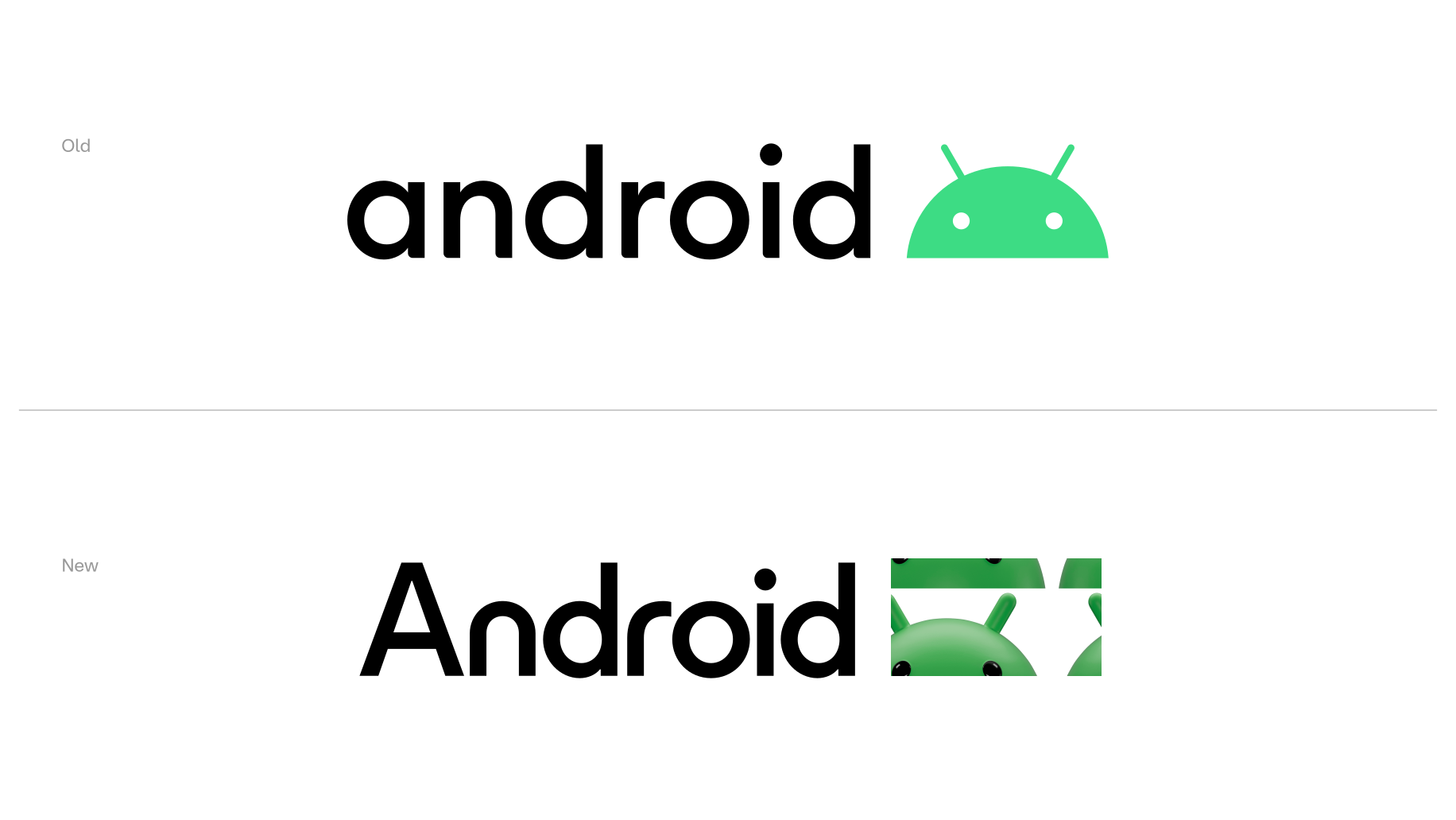
We needed to return to Android’s foundational values of freedom and inclusivity to reassert its future. We helped evolve the Android brand system to be more open and adaptive, transforming the Android logo from a disconnected corporate mark into a brand that all 3.5 billion users could see themselves in — reflecting the creativity and culture where the technology lives.
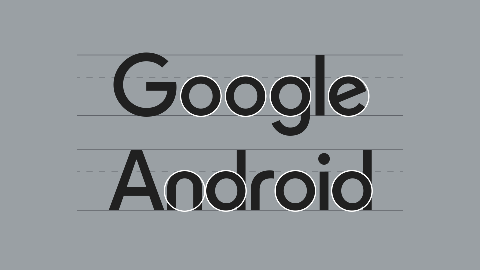
Moving away from the longstanding lowercase stylisation of “android”, we elevated the logo by capitalising the “A”. We matched the weight, proportions, and spacing appearance of Google’s logo, alongside its typographic skeleton (o, d) and rationale construction. The new Android stylisation mirrors Google’s logo more closely, striking a refined balance between the two. They are not twins, but siblings. We retained and emphasised Android’s distinct DNA (n, r) to ensure it remains uniquely Android.
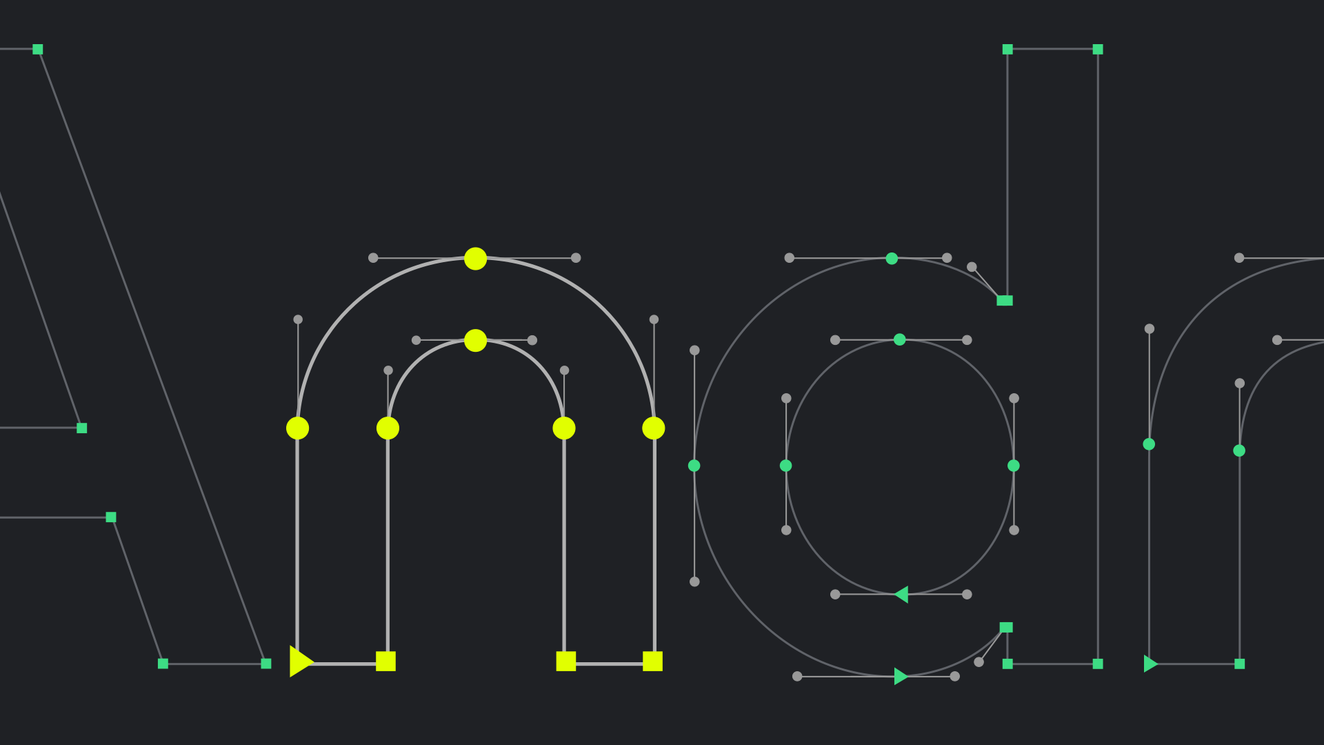
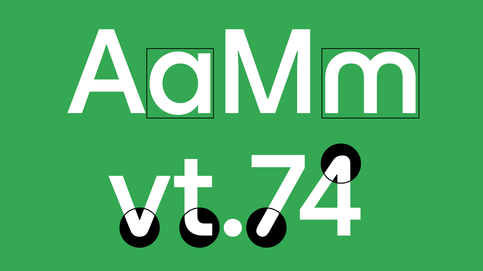
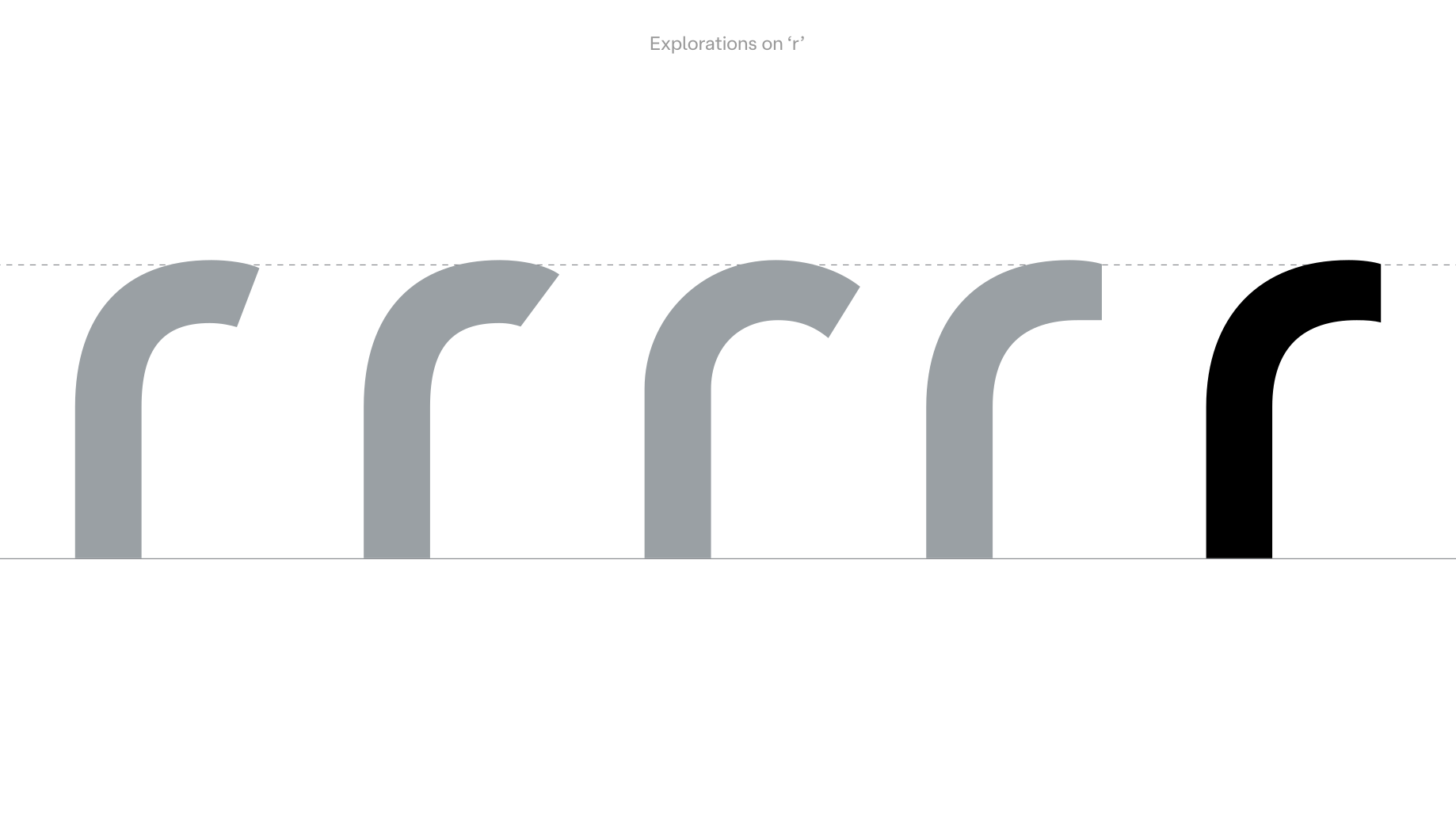
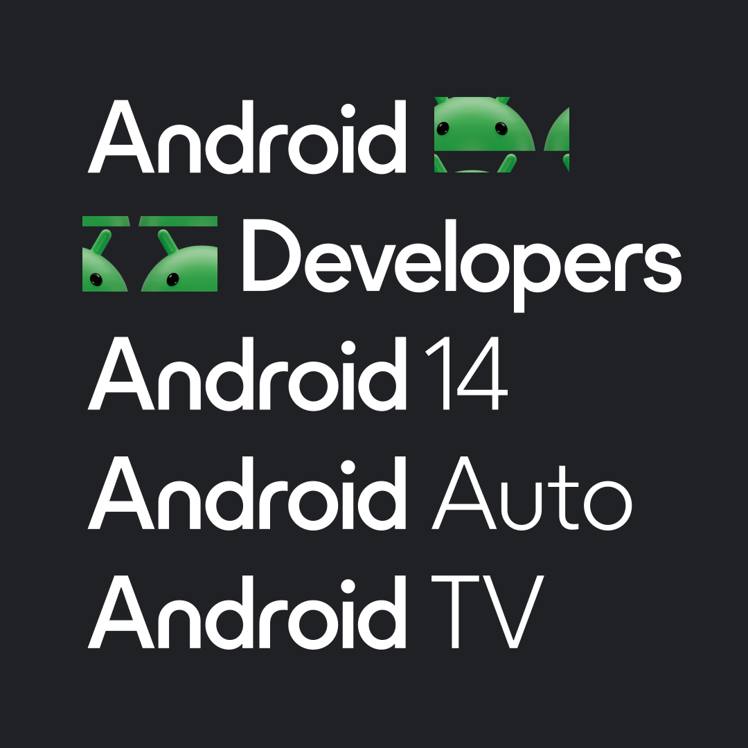
We also expanded the wordmark into a custom typeface to set sub-brands and taglines, including “Developers” (along with new tools created by R/GA to enable co-creation at scale), “Android TV”, “Android Auto”, “Powered by Android”.
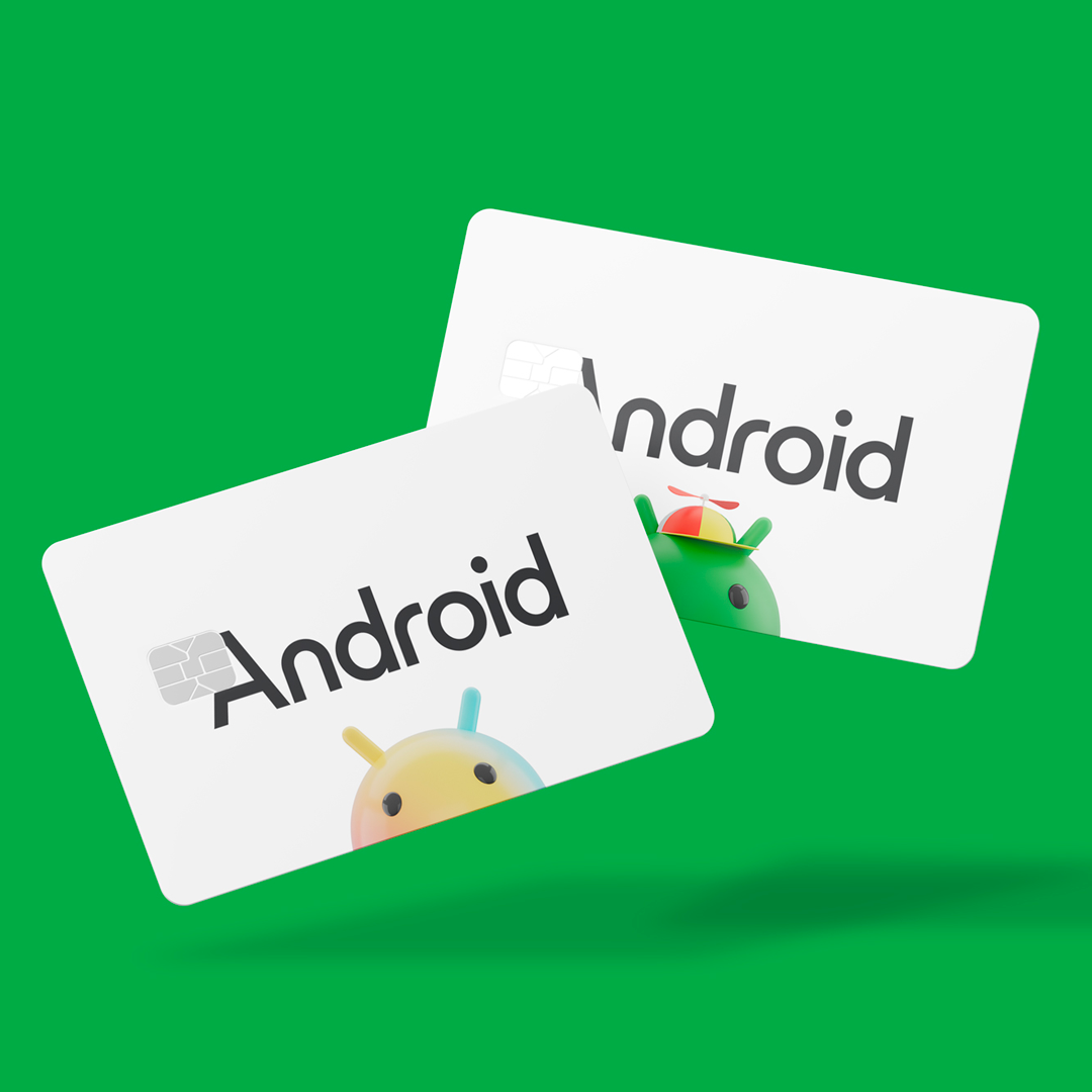
Custom fonts and crafted wordmarks are the best way to convey a unique voice for brands, see more custom type projects.
For more details please contact us →